Product teams are inundated with data. After hours of research, you’re often left with a repository full of transcripts and notes, but the path to a clear set of product requirements or actionable next steps is unclear. Translating raw data into a prioritized backlog is time-consuming and difficult. Insights are where raw customer feedback transforms into a catalyst for action. For researchers, product managers and designers, a well-crafted insight is the bridge between understanding core problems and deciding what to build next. In this lesson, you will learn how to craft findings in a way that centers your raw data, builds a compelling narrative, and drives conversation and alignment with your stakeholders.Documentation Index
Fetch the complete documentation index at: https://docs.dovetail.com/llms.txt
Use this file to discover all available pages before exploring further.
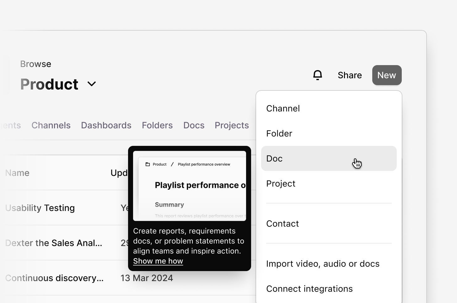
Generate a first draft with AI insights (beta)
AI insights help you create reports and summaries directly from chat. Whether you’re analyzing research, summarizing feedback, or drafting a PRD, AI Insights gives you a fast, flexible way to generate your first draft. Getting started If your workspace has AI insights and Workspace docs betas enabled, you can create a new AI-powered document at a workspace level, within a project or folder.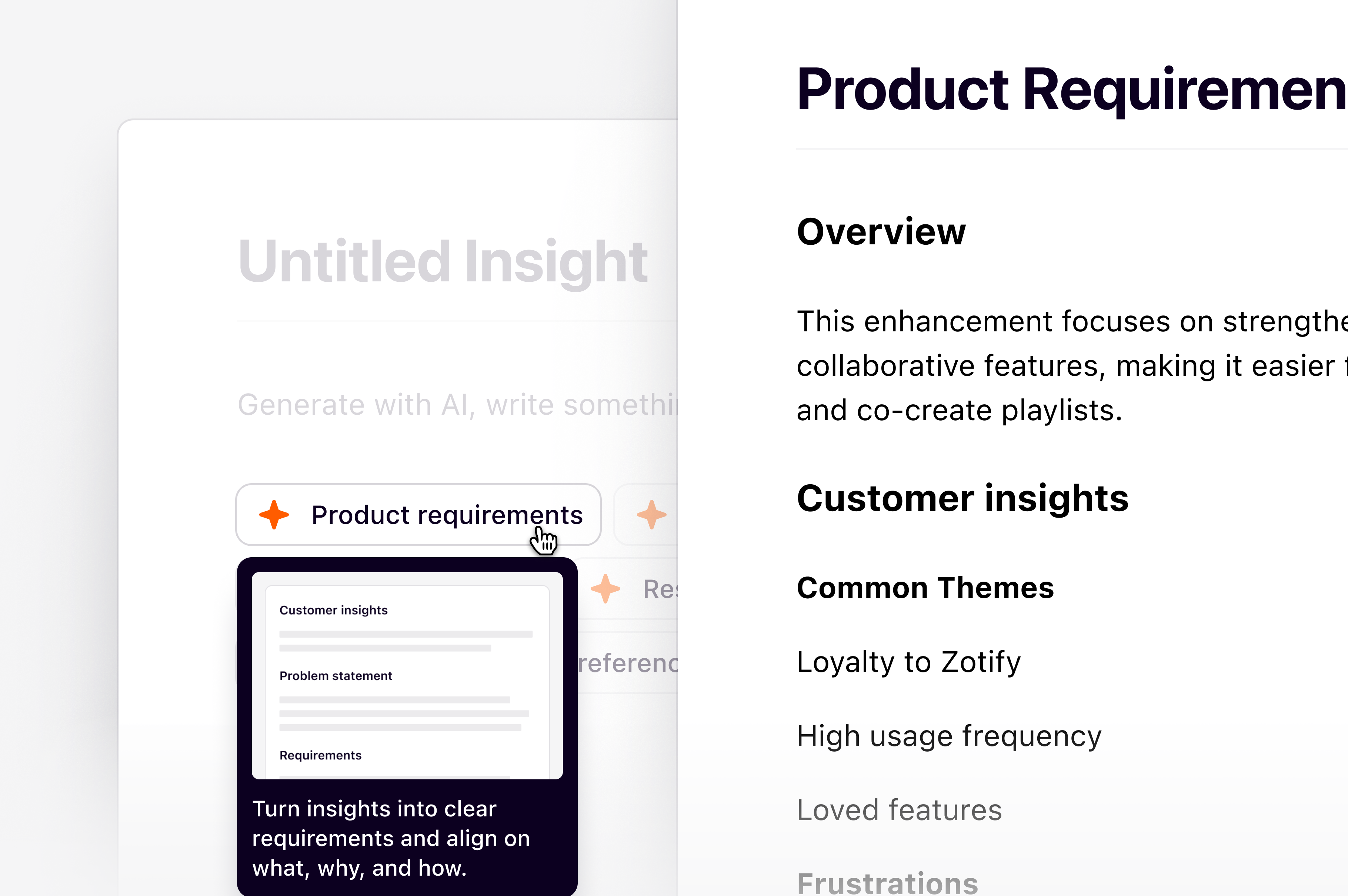
- From a project
- From a channel
- From a folder
To create an insight in a project: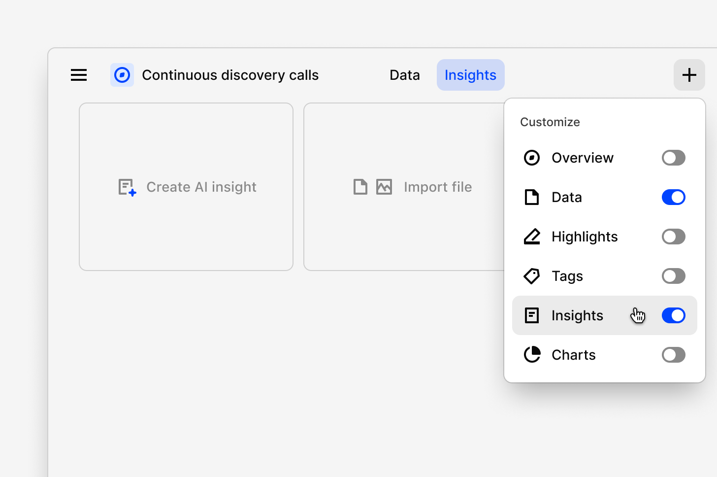
- Select
+and toggleInsighton. - Next, select
Create AI Insight. - From there, choose how you want to create your insight. You can:
- Ask a question or write a custom prompt in chat (e.g. “Summarize key findings from customer interviews”), with the help of **AI insights (beta), **or
- Select a predefined framework like Voice of Customer, Research Report, or PRD.
- Chat will use your project context to generate a complete draft. Once created, you can refine the content in Edit mode, or make manual edits anytime.
Start from a framework for structure, or use a custom prompt for full flexibility. Over time, AI Docs will support both guided and conversational creation.
Why use AI Insights
AI Docs turns time-intensive synthesis into minutes of work. It gives PMs and designers a clear starting point to refine strategy and share insights—without getting lost in the data.
Center direct evidence
A bullet point in a presentation saying “5/8 users found the checkout confusing” lacks impact and can be easily challenged by stakeholders. It fails to convey the emotional weight of the user’s struggle, making it hard to create alignment and urgency within the engineering team or with leadership. Draw attention to your customer’s thoughts and feelings by embedding a video reel directly in your insight. This isn’t a summary of the problem; it is the problem. Stakeholders can watch a 60-second clip showing multiple users sighing in frustration, expressing confusion, or abandoning a task at the exact same point in the workflow. In most cases, one will be made automatically for you after adding highlights to your insight from anywhere in your project. With this reel, you can embed, customize, and re-order video and audio highlights into a reel directly within insights. Reels make the user’s pain undeniable. They build empathy and create a shared understanding across the entire team in a way that no summary can. For a designer, it’s a powerful tool for illustrating a usability issue. For a product manager, it’s a critical asset for making a business case, justifying prioritization, and ensuring the team is truly solving a felt user problem.Curate a concise narrative
Presenting stakeholders with a raw data dump is overwhelming and ineffective. Without a clear narrative, people will draw their own conclusions, or worse, none at all. Your key recommendations can get lost in the noise. Ease stakeholders through your findings by polishing how your data and supporting text is presented. Once your key highlights are in an insight, create a narrative around your findings in whatever way you want. Type/ within the editor to pick a template that works for you or create an insight in your style with available formatting options.
When adding structure to your insight, ensure you:
- Arrange content in visually appealing ways and group related references into 2 or 3-column layouts. You can create distinct side-by-side text sections, feature callouts, and embed references, images, or files.
- Establish clear headings with different sizes, quote blocks, and bulleted lists to summarize key points.